A Dashboard is an element of a graphical user interface (GUI) that displays information of different widgets to a single place or provides a specific way for a user to interact with DNIF. It allows users to build a customized view that is relevant to them, data is added and displayed on the dashboard through the widgets.
How to add Widgets to Dashboard?
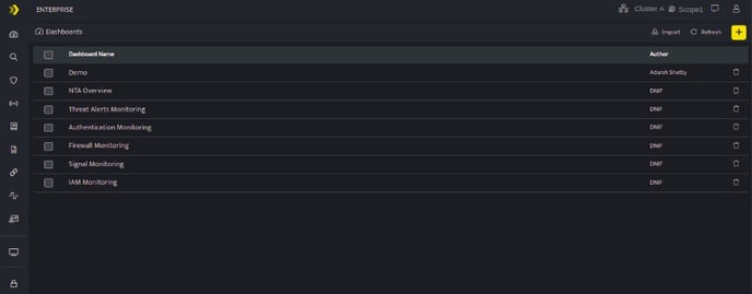
- Click Dashboards icon on the left navigation bar, it will display the list of existing Dashboard visualizations.
Dashboard List

The Dashboard List screen displays the following fields:
| Field Name | Description |
| Dashboard Name | Displays the list of saved dashboards, click this dashboard name to view the particular Dashboard. |
| Author | Displays the name of the user who created this Dashboard visualization. |
| Used to delete the specific Dashboard visualization |
Dashboard allows you to add and arrange multiple widgets to analyze up-to-date information so they can make smarter, data-driven decisions. Dashboards help you to Improve data discovery and helps to identify the true impact of data.
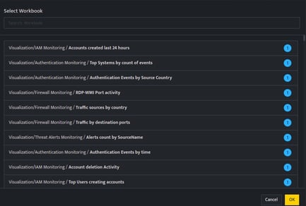
- Go to Dashboard, Click plus sign. The lists of all saved workbooks are displayed.
- The blue circle next to the Workbook name indicates the count of Visualization Graphs available in the Workbook.
- The bullet list icon
 next to the workbook indicates that there are no visualization blocks added to the workbook. For these workbooks, you can directly render the query result as a dashboard widget .

-
Select the workbooks to be rendered as a dashboard widget.
-
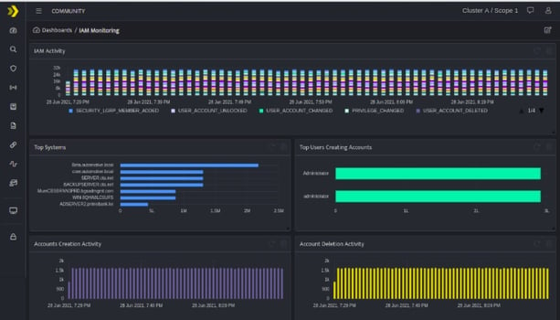
Displayed below is a dashboard view after rendering multiple workbooks.

The following icons are displayed on every individual widget on the dashboard.
| Icons | Description |
| Use this icon to open a particular workbook | |
| Use this icon to refresh the widget | |
| Use this icon to remove the widget from dashboard. This icon will be displayed only in edit mode. |
